TV Rex: A TV recommendation app.
Viewers can track, recommend and receive new recommendations for shows based on their interests and watching habits.
The Prompt
This was my final solo project for my design course. As such, it was open-ended. We had to come up with our own problem and our own solution.
Initial Concept
My inspiration came from watching The Americans with my boyfriend. As we live in separate apartments, we would text each another to see if one of us had watched another episode. Wanting to easily know my place in all of my various shows, as well as my boyfriend or friends' places, I decided to create a solution!
Research
I had to determine if this idea was not limited to just my relationships and to find out if there is a need for this type of app in the market. As such, I started with a survey.
I surveyed 48 people and gained helpful insight.
Main Takeaways:
- People liked the idea of an app for their TV shows.
- Very few users like to leave reviews for what they watch.
- Most users trust and enjoy the recommendations of streaming sites’ algorithms and peer recommendations.
- IMDB and Rotten Tomatoes were the top sites used for reviews and information.
- Most users stream content with Netflix, Amazon Prime, Hulu and HBO being the top platforms used.
- People mostly rely on those sites to keep track of what episode they're on.
Competitive Analysis
Based on the user surveys, I felt good about my initial idea, but needed to research platforms that currently exist to see if/where there is room in the market for TV Rex.
I researched Tubi, Decider and TV Time:
- Hobi is an app that helps you track your progress on shows, but has a small user base.
- TV Time is a social platform for tracking shows and chatting about them.
- Decider helps you decide what to watch next, but is only a website without personalization.
Researching those companies helped me to formulate how to stand out in the market:
- Target an audience that isn’t looking for another social app like TV Time.
- User recommendations should be as personalized as possible.
- Try and find a way to have the streaming apps (Netflix, Hulu, etc) sync to TVRex for easy use.
User Personas
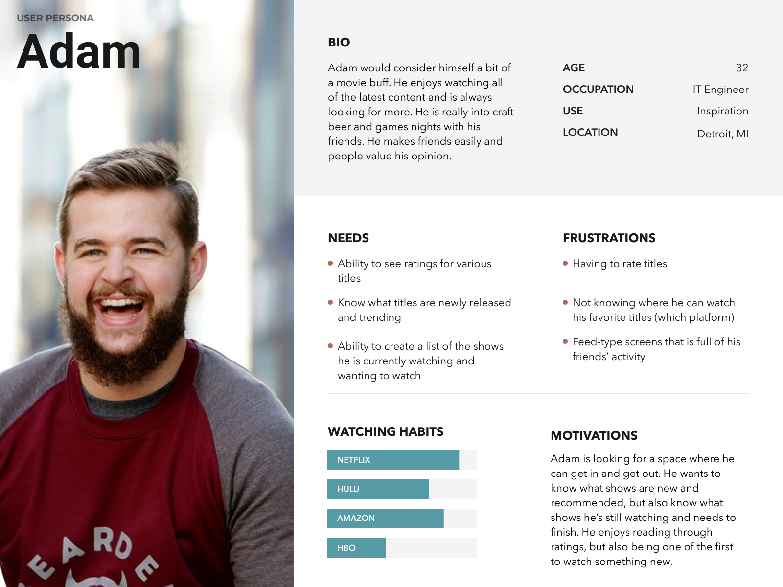
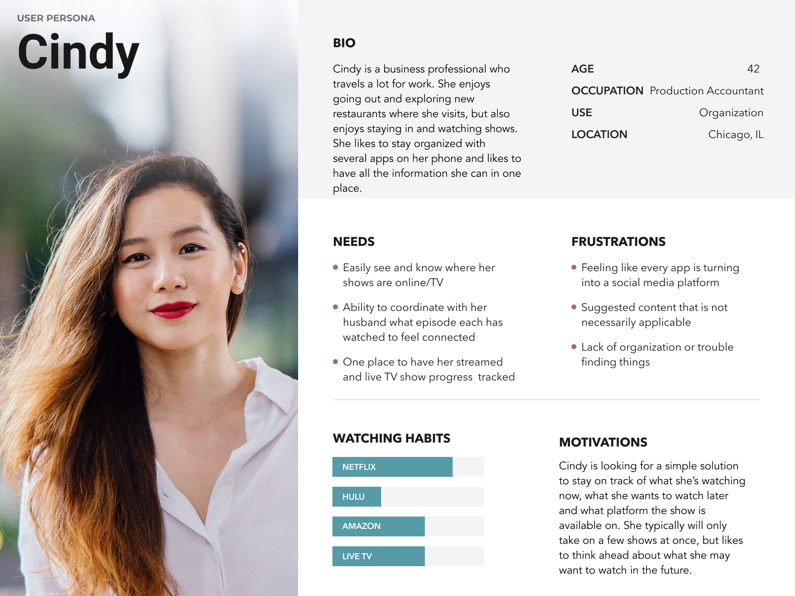
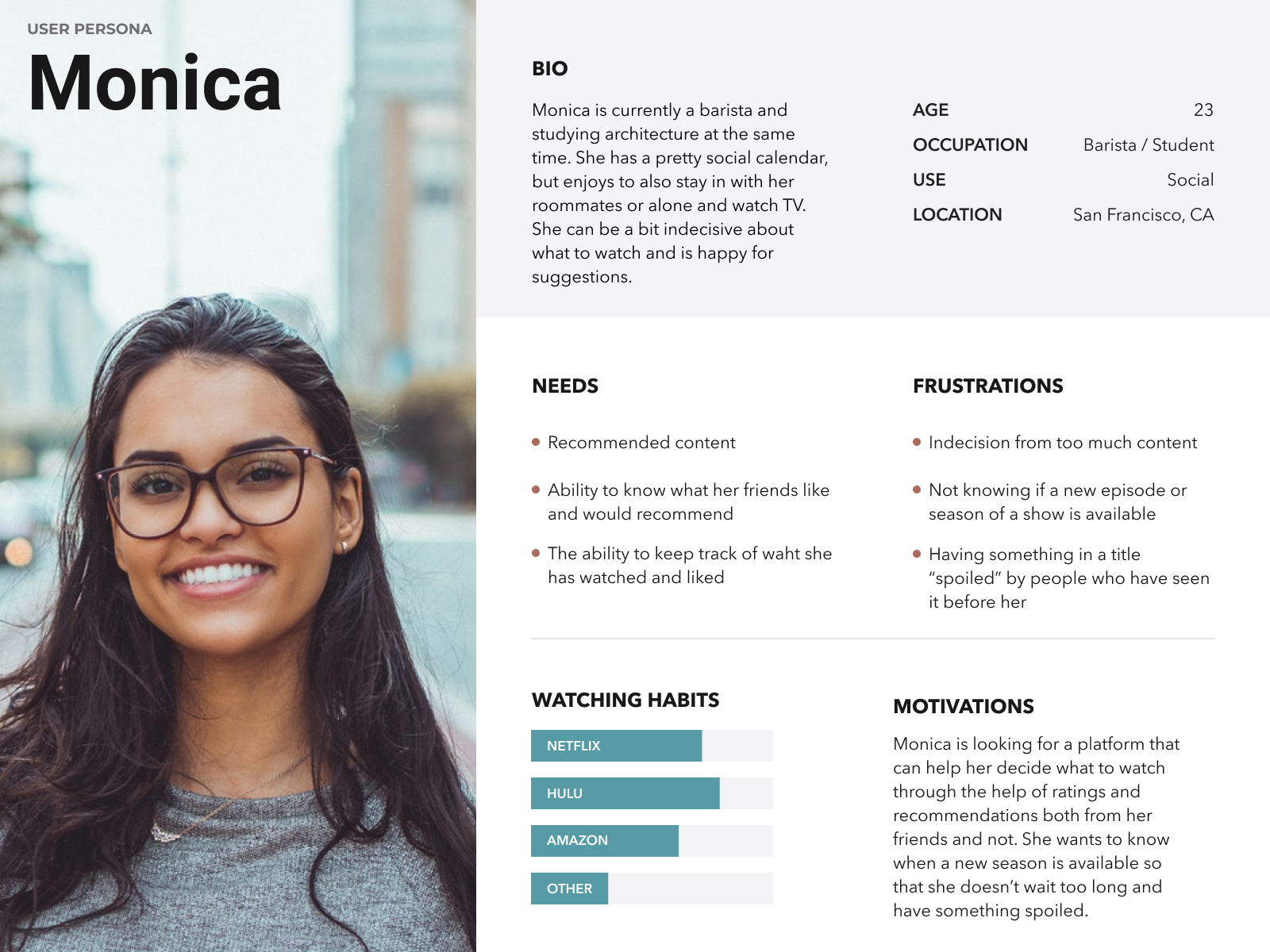
Based off of the initial survey, I was able to create hypothetical users for the User Personas. Here are the various goals that our users have:
User Stories
Also from my research, I was able to determine the various tasks that were integral for the user, organized by priority level.
High Priority
- Sign up for an account
- Sign into an account
- See shows I'm currently watching
- Find what titles my friends recommend
- Find recommendations based off of my shows
- Recommend a title I've seen
- Add a title to a watch list
Medium Priority
- Sync with my streaming accounts
- Add or follow "friends"
- See a title's IMDB rating
- See a title's Rotten Tomatoes rating
- Make a title "invisible" to other users
Low Priority
- See titles I've recommended
- Be alerted a show is coming to a streaming platform
- Click a link to continue watching a show
User Flows
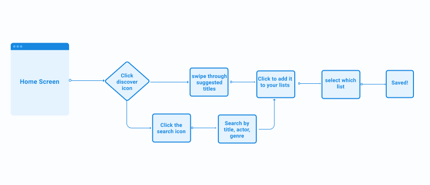
Below is one of the user flows I created for TV Rex that shows how a user would add a new title to a watch list (currently watching, want to watch or have watched.)
Wireframing
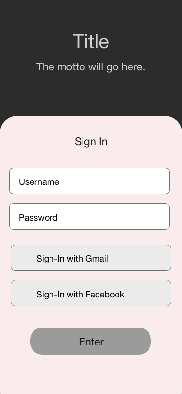
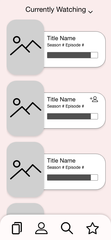
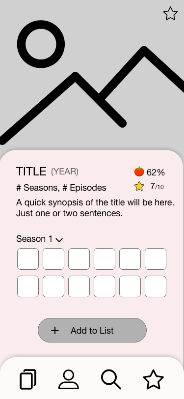
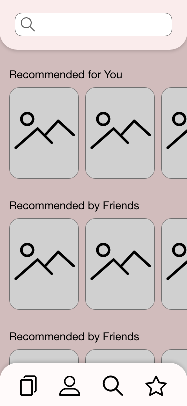
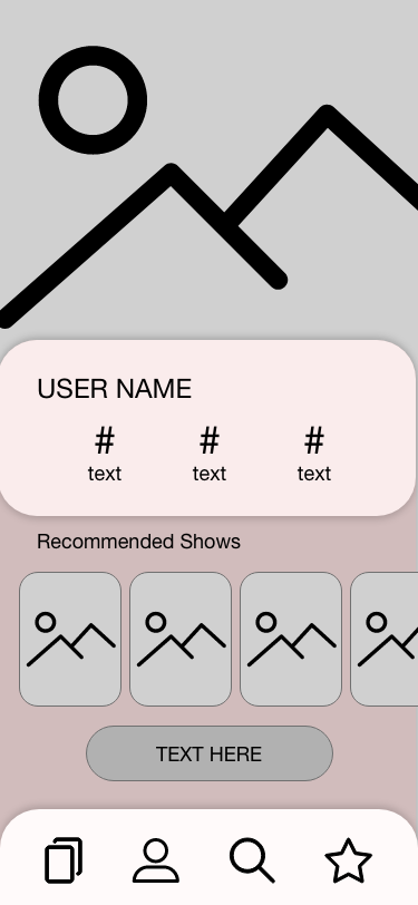
For this project, I started by sketching screen ideas with pen and paper, then moved to Adobe XD.
Sketches
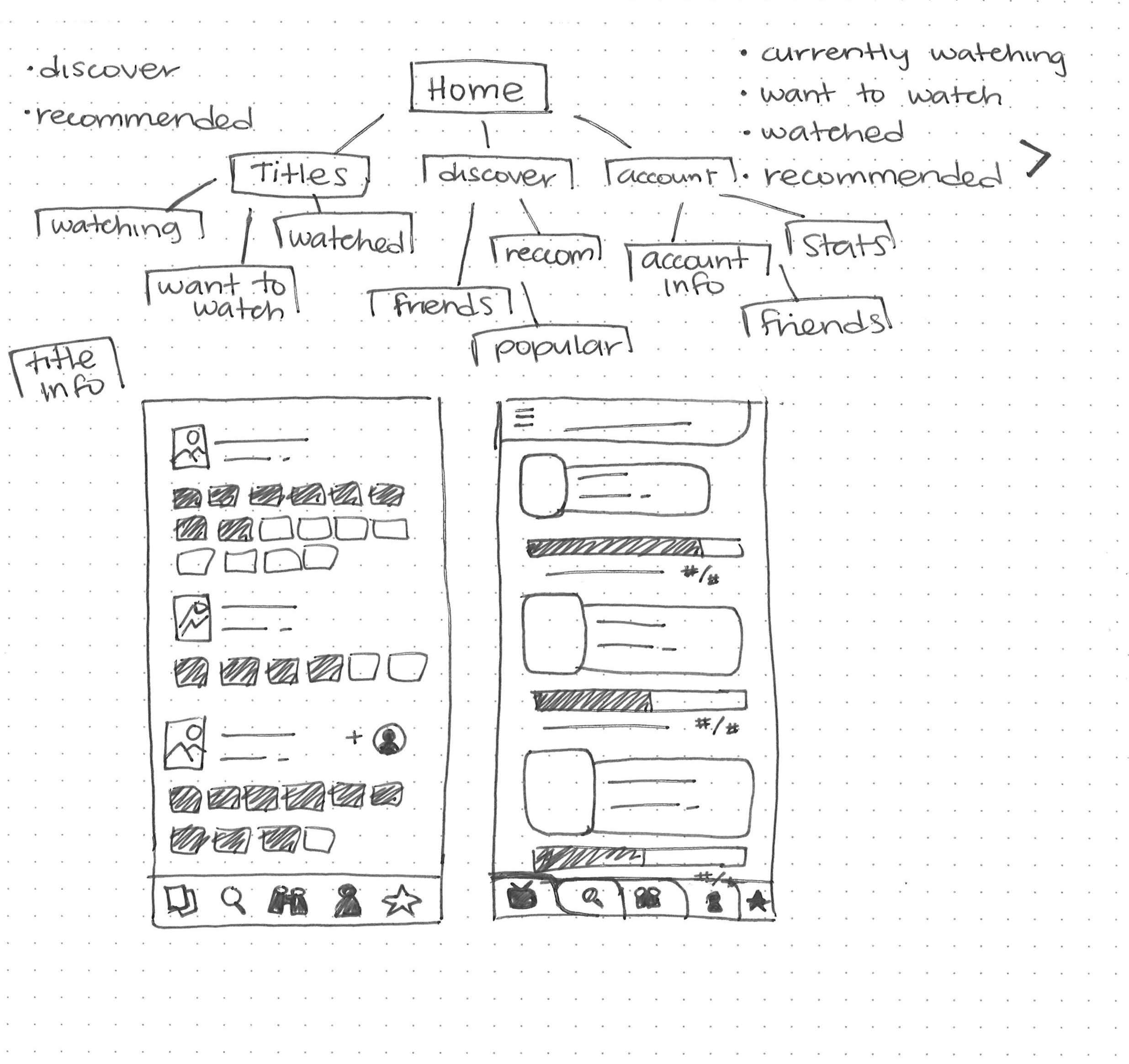
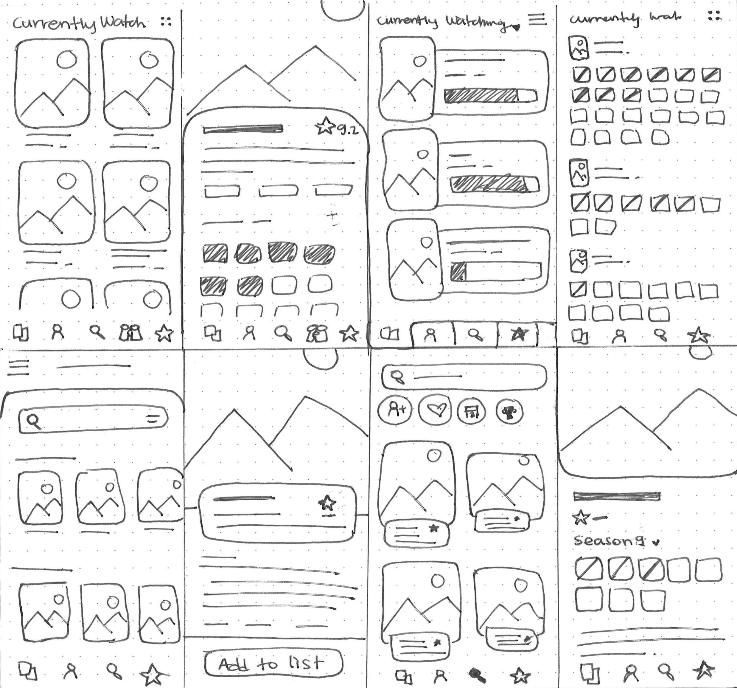
LoFi
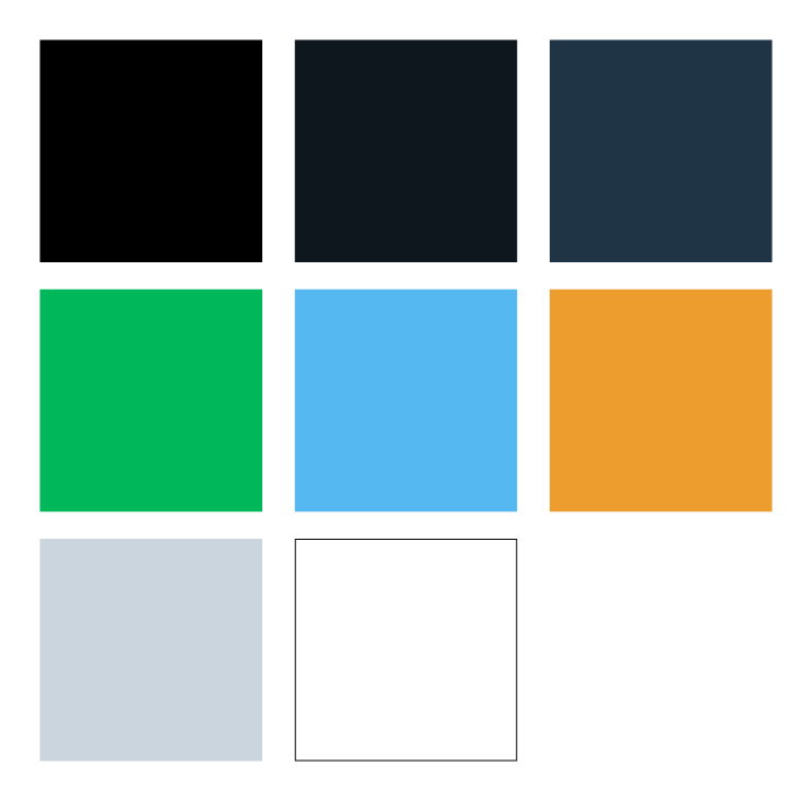
Branding: Name, Logo & Color Palette
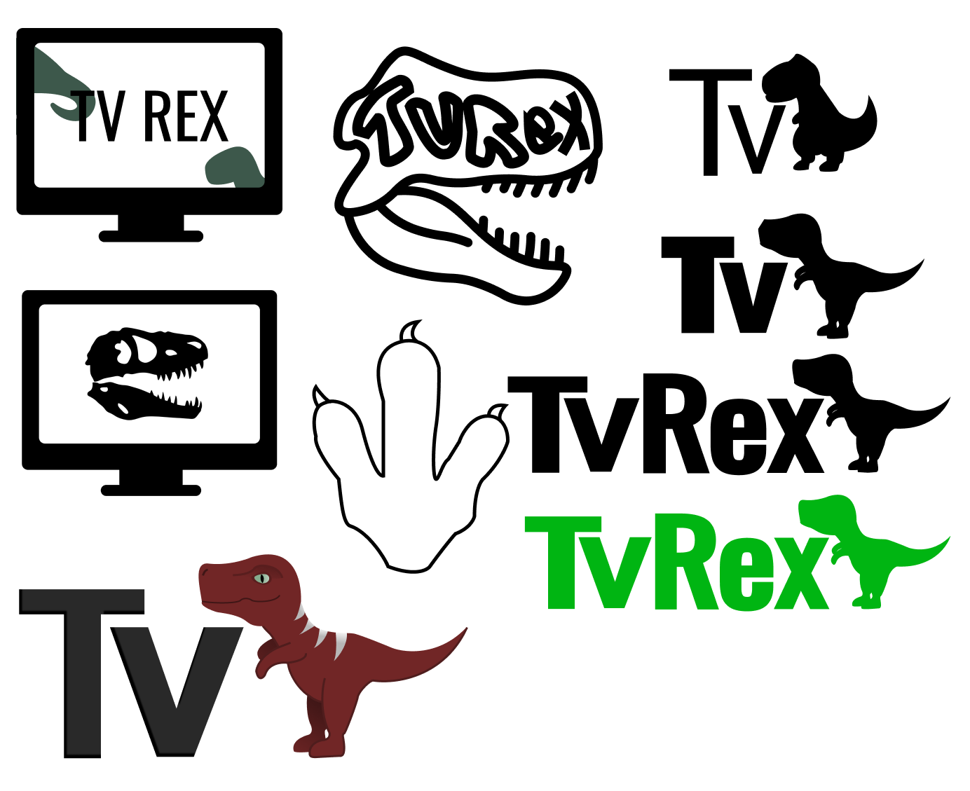
I wanted the name to tie into the app's idea. In the end, I chose TV Rex which is short for TV Recommendations. It really lent itself to a playful logo including a T-Rex's silhouette.
Mockups
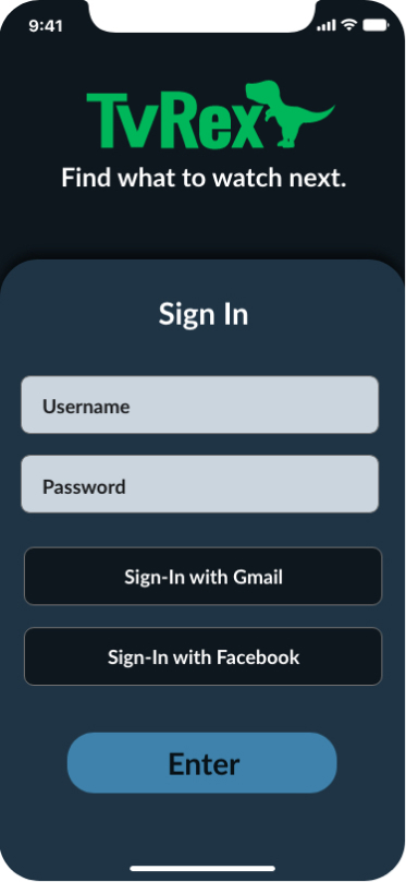
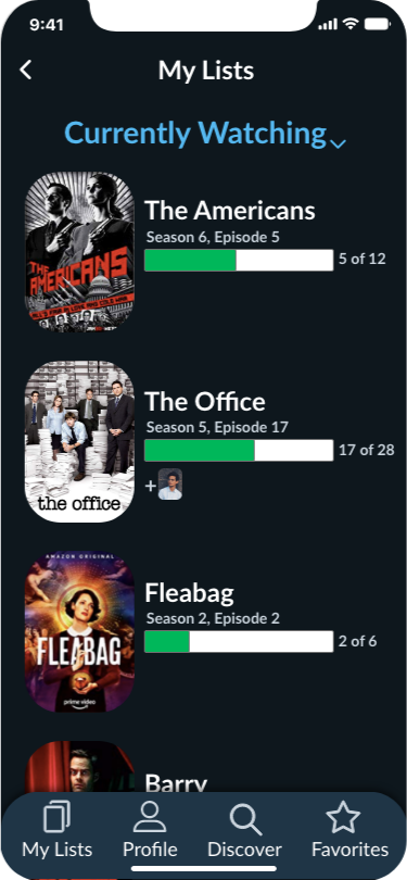
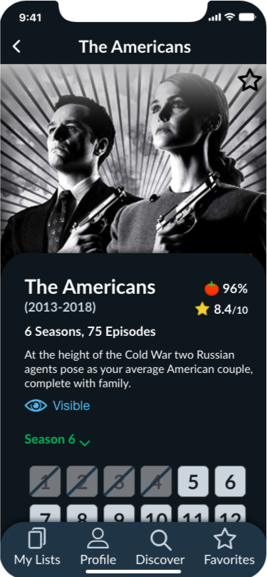
I wanted this app to have a more modern design, so I incorporated a lot of curves and overlapping layers. I also wanted to design for an iPhone X, so I worked on adhering to iOS specs for my various screens.
HiFi
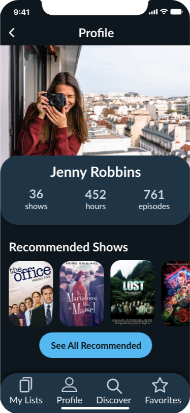
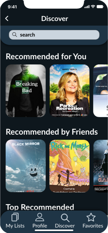
Prototype Testing
I tested my high fidelity prototype to three users. Here are some ideas they had to improve the app:
- Label the green bar on the “currently watching” screen.
- Change the icon to indicate you’re watching with someone, maybe to a small profile photo.
- Change “recommend” to something else during the "Would you recommend this show?" pop-up.
- Change one of the star icons, either the IMDB one or the recommendations one.
Preference Testing
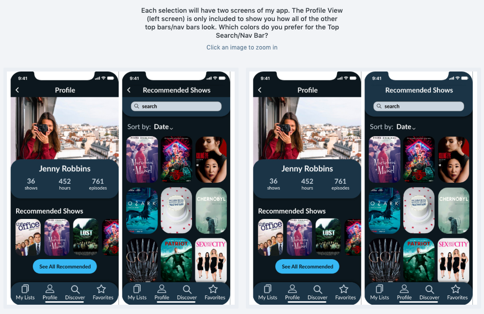
The first preference test was to determine whether or not I should keep the top section of my app (that contains the nav bar and search bar) as two colors, or switch over to one.
The testers liked the two-color nav bar over the one-color to maintain consistency throughout all screens.
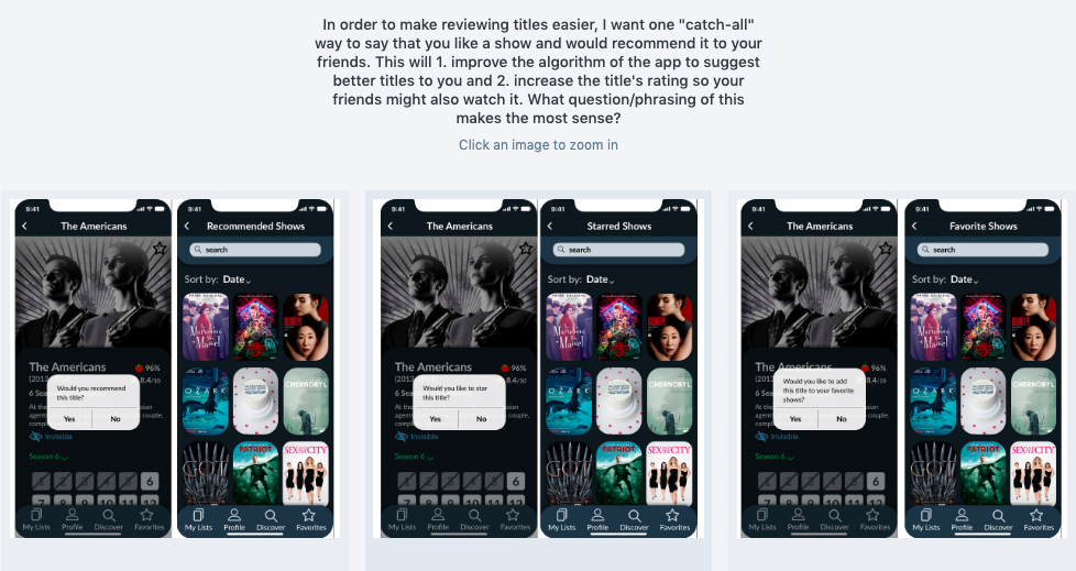
For the second test, I wanted to know what wording made the most sense for my rating/favorites.
The testers decided to keep the wording as "recommend a title" as an encompassing way to suggest and get suggestions.
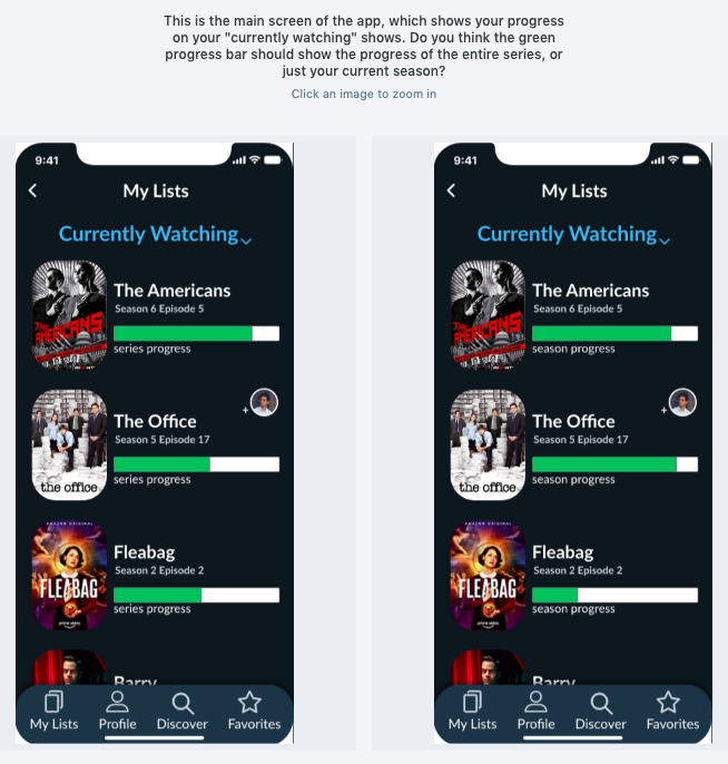
My third preference test focused on the progress bar on the main screen and what it should represent.
This preference test resulted in a change to my design. Users felt it made more sense for the progress bar to represent the season as opposed to the series as a whole. As one user put it, "It would be especially challenging for a show that is currently airing to have a progress bar for the entire series."
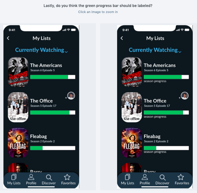
The last preference test asked whether that green progress bar should be labeled.
Unsurprisingly, it was fairly unanymous that labeling that bar would be beneficial to all users.
Iterations
From all the gathered insight from the above tests and my course grader feedback, my screens went through several iterations.
Main Screen Iterations
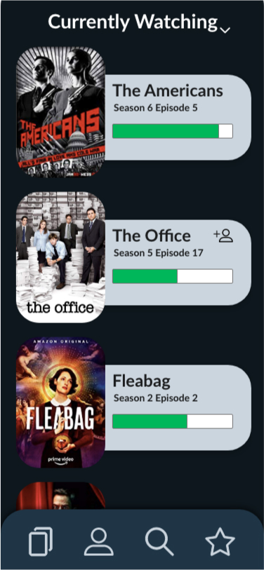
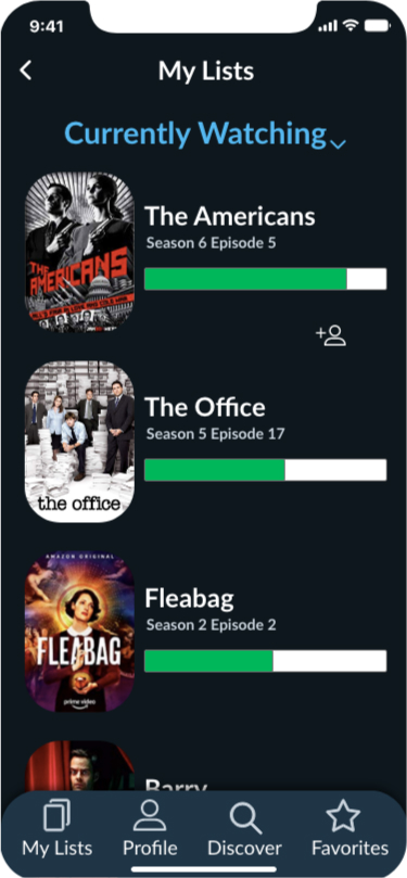
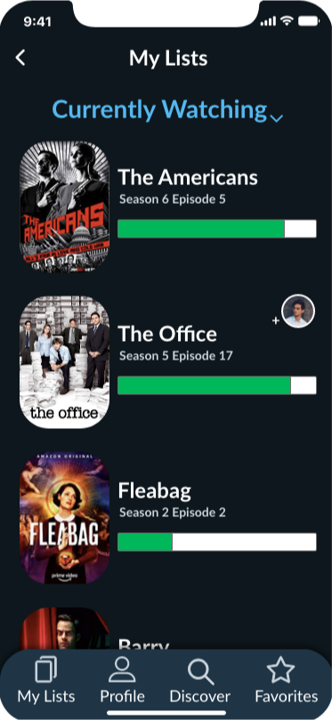
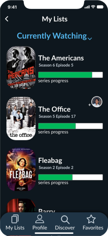

Changes made:
- Removed grey boxes so that it better adhered to iOS specs for lists.
- Added a nav bar at the top to adhere to iOS specs.
- Changed the color of “Currently Watching” to add contrast.
- Added the iPhone X template to show where the screen is cut.
- Allowed more space for the TV show title and made the progress bar wider.
- Added clarification text to help the user know that the progress bar represents a progress for a season.
- Changed the icon to a user's profile picture to display when you’re watching a title with a friend.
The Solution
I wanted to create an app to help users stay organized and up-to-date with their favorite shows. Keeping the user in mind, I had a large focus on information architecture and broke up information with space on every screen. The whole idea was to keep tasks simple so you can find a title, find your place and go. With recommendations from user's friends and followers on top of the app's algorithm, any user will know what they'll enjoy without choice fatigue.
In the end, I created TV Rex: A TV Show platform to keep you organized and give you recommendations. Main functions:
- Keep lists of what you’re currently watching, wanting to watch and have watched
- Add friends or follow people to see their favorite shows
- Track your progress of each title, whether you’re watching alone or with friends
- Get recommendations based off of your recommendations your friends'
Takeaways
- Mastered logo creation and drawing in Figma and Adobe XD with the pen tool.
- Learned how to create a color palette for a dark theme.
- Became proficient in Adobe XD, utilizing components, prototyping and repeat patterns.
- Utilized research and testing throughout the entire process will create better designs.
- Studied key differences between designing for Android and for iOS (alert boxes, list appearance and nav bar, etc).
- By starting to write the case study at the beginning of my project, it allowed me to remember my steps and decisions now that I'm at the end.
